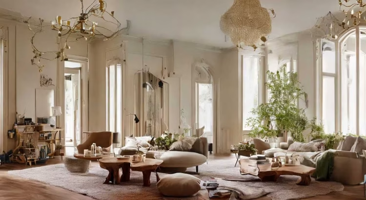
The human connection to nature is deeply rooted in our biology. For centuries, our ancestors lived in direct contact with the natural world, navigating landscapes dominated by soil, stone, foliage, and sky. In the modern era, where much of our time is spent indoors surrounded by synthetic materials and digital screens, this connection has become strained. This shift has given rise to a powerful movement in interior design and environmental psychology focused on bringing the outdoors inside. At the heart of this movement lies the strategic application of earthy color palettes.
An earthy palette draws inspiration directly from the natural environment. These colors are not artificial, neon, or chemically saturated. Instead, they replicate the subtle, muted tones found in forests, deserts, coastlines, and geological formations. By integrating these hues into residential, commercial, and therapeutic environments, designers can profoundly influence the psychological well-being, mood, and perceived comfort of the occupants.
The Psychological Mechanics of Earthy Tones
Color psychology dictates that different wavelengths of light trigger distinct neurological responses. Bright, saturated colors like crimson or electric blue stimulate the nervous system, increasing heart rate and alertness. Conversely, earthy tones operate on a different frequency, encouraging deceleration and stability.
The effectiveness of earthy palettes can be explained through biophilic design theory. This theory suggests that humans possess an innate, genetically determined affinity for the natural world. When we surround ourselves with colors that mimic nature, our brains interpret the environment as safe, resourceful, and predictable. This subconscious recognition triggers the parasympathetic nervous system, lowering cortisol levels, reducing anxiety, and fostering a deep sense of psychological grounding.
Deconstructing the Earthy Spectrum
An earthy palette is far more diverse than a simple assortment of browns and beige. It encompasses a rich taxonomy of colors, each derived from a specific natural element, and each carrying its own distinct emotional resonance.
Terracotta and Clay
Terracotta, rust, and warm clay tones are derived from iron-rich soil and baked earth. These hues carry inherently warm wavelengths that evoke feelings of security, physical comfort, and hospitality. In color psychology, warm earth tones stimulate a sense of community and appetite, making them excellent choices for spaces intended for social interaction.
Sage, Olive, and Forest Greens
Green is the primary color of life, growth, and renewal. Earthy greens are characterized by their muted, desaturated qualities, often leaning toward gray or brown undertones. Unlike vibrant lime green, sage and olive greens read as neutrals to the human eye. They reduce visual fatigue, promote mental clarity, and induce a state of restorative calm, closely mimicking the experience of looking at a forest canopy.
Ochre, Mustard, and Sand
Yellows found in an earthy palette are tempered by brown and cream undertones, resulting in shades like raw ochre, wheat, and warm desert sand. These colors provide a gentle, non-stimulating sense of optimism and light. They lift the mood of a room without triggering the hyperactivity or agitation sometimes caused by pure, bright yellow.
Charcoal, Slate, and Stone Grays
The darker anchors of the earthy palette come from geological formations. Slate, charcoal, and warm granite tones provide structural contrast. These colors represent permanence, strength, and endurance. When used correctly, they give a room a sense of sophisticated permanence and sophisticated quietude.
The Intersection of Mood and Spatial Comfort
Comfort is not merely a physical sensation derived from a soft mattress or an ergonomic chair; it is an emotional and cognitive state. Earthy palettes influence two primary dimensions of comfort: thermal perception and acoustic serenity.
Thermal Comfort and Perception
Colors possess an incredible ability to alter our perception of temperature. Studies in environmental psychology show that individuals in spaces painted with warm earthy tones, such as terracotta or deep beige, perceive the room to be several degrees warmer than it actually is. This psychological warming effect enhances the feeling of coziness during colder seasons and can even reduce reliance on mechanical heating. Conversely, cool earthy tones like slate or mossy sage can make a sun-drenched, hot room feel refreshing and breezy.
Stress Reduction and Mental Decompression
In a fast-paced society, the home serves as a sanctuary from sensory overload. Bright white walls can feel sterile, clinical, and jarring, reflecting harsh artificial light directly into the eyes. Earthy tones absorb light rather than reflecting it aggressively. This reduces glare and visual noise, allowing the eyes to rest. When the visual field is relaxed, the mind follows suit, making earthy spaces highly effective environments for decompression after a stressful workday.
Strategies for Implementing Earthy Palettes
Successfully executing an earthy design scheme requires a careful balance of tone, texture, and contrast to prevent the space from feeling muddy, dark, or monotonous.
The Rule of Tonal Layering
To create depth in an earthy room, avoid using a single shade of brown or green across all surfaces. Instead, employ tonal layering. Combine multiple variations of the same color family. For example, in a living room, you might pair pale sandy walls with a mid-tone taupe sofa, charcoal-colored accent chairs, and deep espresso wood trim. This creates a rich, sophisticated hierarchy that guides the eye naturally through the space.
Incorporating Organic Textures
Earthy colors lose their impact if applied strictly to smooth, synthetic surfaces. To maximize their psychological benefits, these hues must be paired with organic, tactile materials. The human brain associates earthy colors with specific physical textures.
-
Pair terracotta with raw, unpolished ceramics and brick.
-
Pair sage greens with washed linen, slubby cotton, and woven jute.
-
Pair stone grays with rough-hewn timber, matte marble, and split-face stone.
The variation in texture creates natural highlights and shadows, bringing the earthy colors to life and reinforcing the connection to the physical landscape.
Balancing with Light and Contrast
A common misconception is that an earthy palette will make a home look gloomy. To prevent this, ensure ample access to natural light. Large windows that frame actual outdoor foliage complement the interior palette perfectly. Furthermore, incorporate crisp, warm white tones on ceilings or architectural molding to serve as a visual palette cleanser, keeping the earthy shades looking intentional and refined.
Frequently Asked Questions
Will using an earthy palette make my small room look even smaller?
Not necessarily. While dark earthy tones like charcoal or deep chocolate can make walls feel like they are closing in if used incorrectly, lighter earth tones can actually expand a space. Shades of pale sand, warm linen, and soft sage reflect light beautifully while maintaining a cozy atmosphere. If you want to use a dark earth tone in a small room, consider using it on all walls and the ceiling to erase the hard boundaries of the room, which creates an illusion of endless depth.
How do I transition my current modern gray home into an earthy palette?
You do not need to repaint your entire house immediately. Start by identifying the undertones of your current gray. If it is a cool gray with blue undertones, transition toward stone and slate grays, then gradually introduce olive green textiles and light white-oak furniture. If your gray has warm undertones, it will easily welcome accents of terracotta, ochre, and warm beige through throw pillows, rugs, and earthenware pottery.
Are earthy colors suitable for a high-productivity home office?
Yes, earthy palettes are excellent for workspaces. While bright colors can cause distraction and stark whites can cause eye strain, muted earthy greens and warm sand tones foster prolonged focus and cognitive endurance. Green, in particular, has been shown to improve reading comprehension and creative problem-solving by keeping the brain in a calm yet alert state.
How can I prevent an entirely brown and beige room from looking boring?
The key to preventing boredom in a neutral earthy room is high contrast and diverse texture. Ensure you have a full spectrum of tones, from the brightest cream to the deepest espresso. Introduce architectural interest through wooden wall paneling or textured plaster finishes. Finally, bring in varied materials like matte black metal hardware, woven rattan baskets, and sheepskin throws to create visual dynamics without adding loud colors.
Can earthy palettes be used in a sleek, ultra-modern interior design style?
Absolutely. Earthy palettes are a foundational component of modern organic and Japandi design styles. Instead of the traditional rustic application, apply earthy colors to clean, minimalist silhouettes. A minimalist kitchen with flat-panel walnut cabinets, beige quartzite countertops, and concrete floors feels incredibly modern while remaining deeply grounded in an earthy aesthetic.
Do earthy colors affect our sleep patterns when used in the bedroom?
Yes, they have a positive impact on sleep hygiene. The bedroom should be a zone of absolute rest. Cool, muted earth tones like sage green, dusty clay, and soft taupe lower the heart rate and prepare the body for slumber. These colors do not stimulate the brain before bedtime, unlike bright or highly saturated colors, making it much easier to transition into a deep, restful sleep state.