

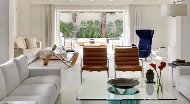
Owning a home is one of the most significant investments a person can make, yet many individuals feel entirely overwhelmed when it comes to decorating the interior. Walking into a furniture showroom or browsing digital design platforms can result in decision paralysis. Homeowners often purchase beautiful individual items only to find that, when placed together in a room, the space feels disjointed, cramped, or uninviting.
The issue is not a lack of taste, but rather a lack of foundational knowledge. Interior design is not an abstract, purely artistic talent; it is a discipline governed by specific structural principles, spatial relationships, and psychological triggers. By mastering the core principles of interior design, any homeowner can transform their living spaces into functional, cohesive environments that feel comfortable, intentional, and balanced.
The Principle of Scale and Proportion
Scale and proportion form the bedrock of spatial design. Scale refers to how the size of an object relates to the actual dimensions of the room it occupies. Proportion refers to the size relationship between two or more objects within that space.
Understanding Room Scale
A common design error is introducing furniture that clashes with the physical volume of a room. For instance, placing an oversized, plush sectional sofa into a compact urban apartment will choke the walking pathways and make the room feel suffocating. Conversely, putting a delicate, low-profile loveseat into a cavernous living room with vaulted ceilings will cause the furniture to look lost, making the space feel cold and unanchored. Before buying furniture, measure your ceiling height and floor area, ensuring that large pieces leave adequate breathing room around the edges.
The Golden Ratio and Visual Balance
To achieve pleasing proportions, interior designers often rely on the golden ratio, which breaks down to a rule of thirds. When arranging a layout, aim for a distribution where two-thirds of the room is dedicated to furniture and functional zones, while the remaining one-third is left entirely empty as negative space. This negative space gives the human eye a place to rest and prevents the environment from feeling chaotic.
Mastering the Layered Lighting Scheme
Lighting is the element that defines the atmosphere and functionality of a home. A beautiful room with poor lighting will look flat and unappealing, while a modest room with strategic illumination can feel incredibly luxurious. The secret to success is avoiding reliance on a single overhead light fixture. Instead, you must layer three distinct types of lighting.
Ambient Lighting
Ambient lighting provides the baseline illumination for the entire room, allowing occupants to move around safely. This is typically achieved through recessed ceiling lights, central flush-mount fixtures, or natural daylight filtering through windows. Ambient light should be soft and evenly distributed.
Task Lighting
Task lighting delivers focused, direct light where specific activities take place. It prevents eye strain during daily routines.
-
In the kitchen: Under-cabinet LED strips illuminate food preparation countertops.
-
In the living room or bedroom: A dedicated reading lamp next to an armchair or nightstand directs light onto pages or devices.
-
In the home office: A flexible desk lamp focuses illumination on paperwork and computer screens.
Accent Lighting
Accent lighting is purely decorative, used to highlight architectural features, artwork, or specific design collections. Directional track lighting pointed at a canvas painting, or hidden LED strip lights tucked underneath floating shelves, add depth, drama, and visual interest to the room.
Achieving Balance and Focal Points
A room without a clear focal point feels directionless. The human brain naturally seeks a visual anchor when entering a space. Without one, the eyes dart around frantically, causing a subtle feeling of unease.
Creating or Enhancing a Focal Point
A focal point is the first feature that captures your attention. Some rooms possess natural architectural focal points, such as a large stone fireplace, an expansive bay window framing an outdoor view, or a built-in bookcase. If a room lacks an inherent feature, you must create one. This can be achieved by painting a single accent wall in a deep hue, hanging a massive piece of artwork above a console table, or positioning a striking piece of statement furniture in a central location.
Symmetrical versus Asymmetrical Balance
Once the focal point is established, arrange the rest of the room to achieve balance around it.
-
Symmetrical Balance: This approach involves mirroring objects on either side of a central axis, such as placing identical nightstands and matching lamps on both sides of a bed. This creates a formal, traditional, and highly organized aesthetic.
-
Asymmetrical Balance: This technique achieves balance by pairing objects of differing visual weights. For example, you might balance a heavy sofa on one side of a room with two lightweight armchairs and a small side table on the other. This results in a more casual, modern, and dynamic environment.
The Discipline of Color Theory and the 60-30-10 Rule
Color has a profound impact on human mood and spatial perception. Selecting a color scheme requires a disciplined approach to prevent the palette from becoming overwhelming or completely washed out.
Implementing the 60-30-10 Distribution
To ensure harmony, distribute your colors using a precise mathematical ratio:
-
60 Percent Dominant Color: This is the primary backdrop of the room, typically applied to the main walls, large area rugs, or dominant cabinetry. It should be a versatile, highly livable neutral tone.
-
30 Percent Secondary Color: This hue supports the dominant color but provides distinct contrast. It is applied to large furniture pieces, window drapery, accent chairs, or an individual accent wall.
-
10 Percent Accent Color: This is your brightest or most daring color choice, used sparingly to add energy and personality. Apply it to throw pillows, artwork, small decorative accessories, and floral arrangements.
Visual Temperature
Be mindful of the psychological temperature of your palette. Warm colors like terracotta, cream, and soft gold make a room feel cozy and inviting, which is ideal for dining rooms and living spaces. Cool colors like slate gray, soft blue, and sage green promote calm and relaxation, making them highly effective choices for bedrooms and home offices.
The Importance of Texture and Material Contrast
Texture is the secret weapon of interior design. It refers to the tactile quality of materials or how the brain perceives those surfaces visually. A room decorated entirely in a single texture—such as all smooth leather and polished glass—will look clinical, cold, and flat, even if the color palette is perfect.
Mixing Textures for Warmth and Depth
To create a rich, inviting space, mix contrasting tactile surfaces throughout the room.
-
Pair smooth surfaces like polished marble, glass, and metals with rough surfaces like raw timber, brick, or concrete.
-
Layer soft textiles such as a thick wool rug, crisp linen curtains, velvet throw pillows, and a chunky knit blanket over a smooth leather sofa.
The interaction between these varying materials creates visual depth through highlights and shadows, adding an undeniable layer of physical and psychological comfort to the home.
Frequently Asked Questions
What is the correct height for hanging artwork on a residential wall?
A universal standard in the design industry is to hang artwork at eye level. Specifically, the vertical center of the frame or canvas should be exactly fifty-seven to sixty inches from the floor. If you are hanging artwork above a piece of furniture like a sofa or a credenza, ensure the bottom of the frame sits roughly six to eight inches above the top of the furniture piece so the two elements feel connected rather than disconnected.
How far should an area rug extend underneath living room furniture?
To anchor a living room arrangement successfully, avoid using a small rug that floats in the center of the room. The rug should be large enough so that at least the front two legs of all major seating pieces rest securely on top of the fibers. Ideally, all four legs of the sofa and chairs should fit entirely on the rug, which unifies the furniture grouping into a distinct conversational island.
How do I determine the right size for a dining room chandelier?
To find the ideal diameter for a dining room light fixture, add the length and width of the room in feet together, and convert that number into inches. For example, if your dining room is twelve feet by fourteen feet, the sum is twenty-six, meaning your chandelier should be approximately twenty-six inches in diameter. Additionally, ensure the bottom of the fixture hangs thirty to thirty-six inches above the dining table surface.
What is the minimum clearance needed for major walking pathways in a house?
To maintain comfortable traffic flow and prevent a home from feeling tight, all primary hallways and main walking paths between furniture groupings should maintain a minimum width of thirty-six inches. Secondary pathways, such as the space between a coffee table and a sofa, can be compressed slightly but should still offer at least eighteen inches of clearance for easy movement.
How can I make low ceilings feel higher using design tricks?
To create the illusion of vertical height in a room with low ceilings, hang your window drapery rods as high as possible, just a few inches below the ceiling line, and let the fabric extend all the way down to touch the floor. This draws the human eye upward, accentuating the vertical plane. You can also utilize low-profile furniture silhouettes and paint the ceiling in a bright, reflective white with a satin or semi-gloss finish to lift the space visually.
Should all the rooms in my house follow the exact same design style?
While you do not need to decorate every room identically, your entire home should maintain a sense of visual continuity. You can achieve this by establishing a thread of consistency throughout the property. This could be a shared flooring material, a consistent trim color on all baseboards and doors, or a recurring accent color that appears in subtle ways within each unique room, preventing the house from feeling disjointed as you move through it.


